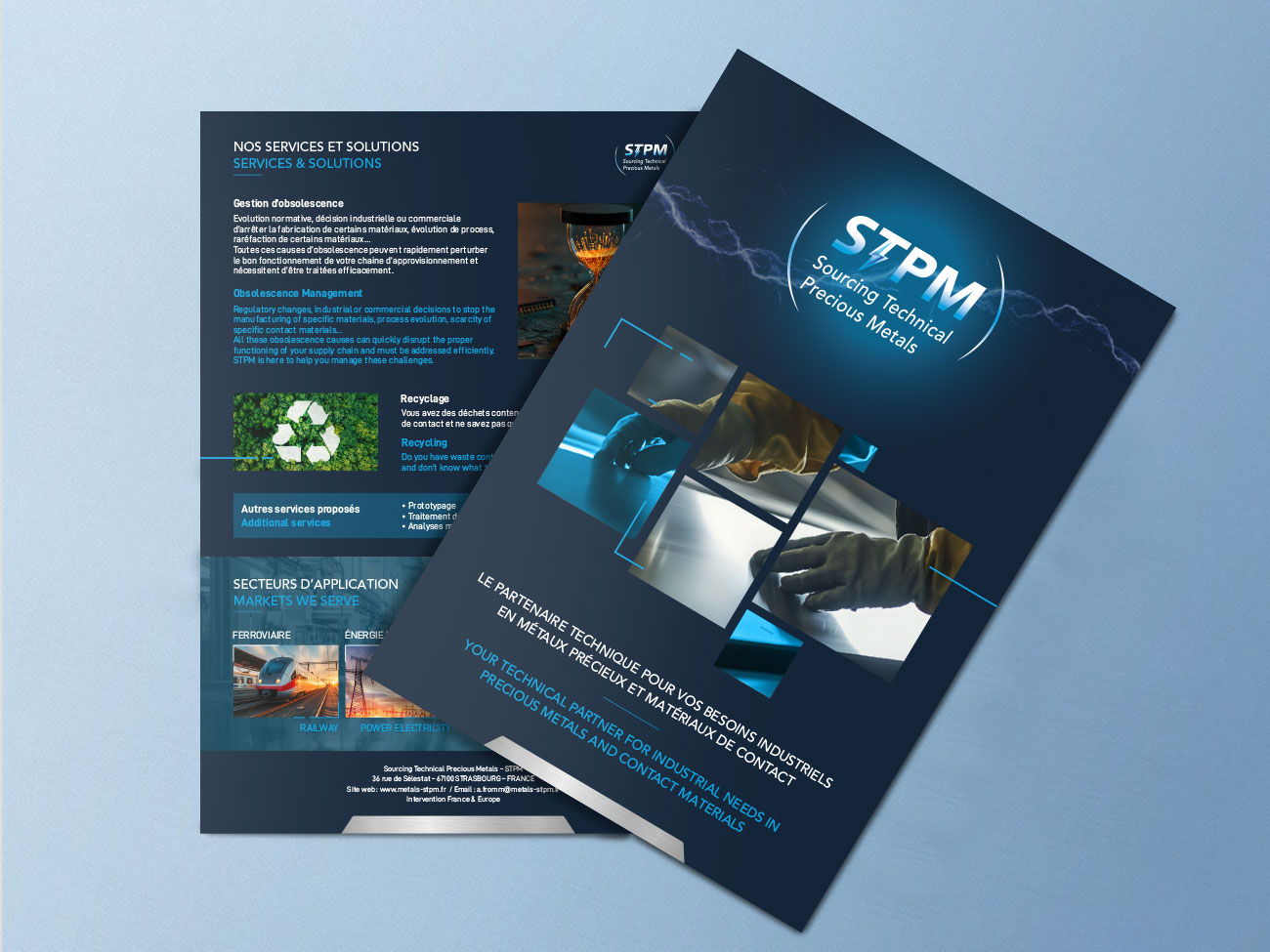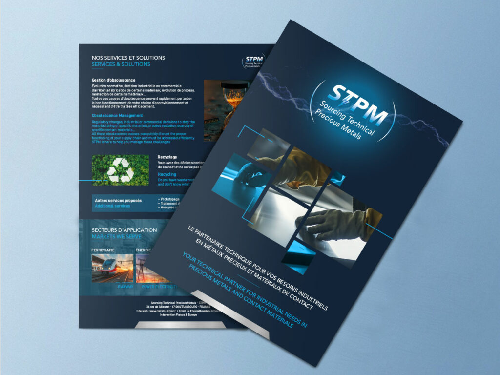
Design of a bilingual brochure/catalog for STPM, highlighting its high-value-added industrial services through a structured, modern, and technical design.
As part of my role at Krysalidesign, I was responsible for producing the year-end catalog for STPM, a company specializing in the sourcing and operational management of high-value-added contact materials, primarily for the rail, electric power, green mobility, and aerospace sectors.
The goal of this project was to design a professional, bilingual print publication that was clear, attractive, and easy to navigate, showcasing all of the services offered by the company. The project began with a series of discussions with the client to gain a thorough understanding of its operations and challenges, and to work together to establish a hierarchy of information—which is essential for structuring the content effectively.
From a graphic design perspective, I sought to visually convey the STPM brand identity by drawing inspiration from two key concepts: metal and electricity. This was achieved through the use of textures evoking metallic materials, combined with linear graphic elements reminiscent of printed circuit boards, reflecting the company’s technical and industrial fields. These choices helped strengthen the visual identity of the material while maintaining a clean and professional look.
The layout was designed to ensure a smooth reading experience in both languages, while maintaining visual consistency throughout the document. This project demonstrated my ability to design technical print materials, visually convey complex industrial concepts, and collaborate closely with a client to meet their communication needs.
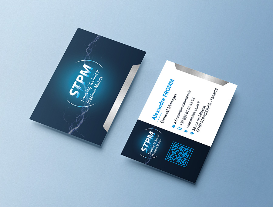
STPM’s satisfaction with the outcome of this project led to further collaboration on other projects, including the design of business cards and technical diagrams, which strengthened the relationship of trust established with the company.
As part of my role at Krysalidesign, I was responsible for producing the year-end catalog for STPM, a company specializing in the sourcing and operational management of high-value-added contact materials, primarily for the rail, electric power, green mobility, and aerospace sectors.
The goal of this project was to design a professional, bilingual print publication that was clear, attractive, and easy to navigate, showcasing all of the services offered by the company. The project began with a series of discussions with the client to gain a thorough understanding of its operations and challenges, and to work together to establish a hierarchy of information—which is essential for structuring the content effectively.
From a graphic design perspective, I sought to visually convey the STPM brand identity by drawing inspiration from two key concepts: metal and electricity. This was achieved through the use of textures evoking metallic materials, combined with linear graphic elements reminiscent of printed circuit boards, reflecting the company’s technical and industrial fields. These choices helped strengthen the visual identity of the material while maintaining a clean and professional look.
The layout was designed to ensure a smooth reading experience in both languages, while maintaining visual consistency throughout the document. This project demonstrated my ability to design technical print materials, visually convey complex industrial concepts, and collaborate closely with a client to meet their communication needs.
STPM’s satisfaction with the outcome of this project led to further collaboration on other projects, including the design of business cards and technical diagrams, which strengthened the relationship of trust established with the company.